How to write cleaner CSS when implementing a responsive design

TL; DR;
Write cleaner CSS and avoid seeing it crossed out by encapsulating it in different media queries when implementing a responsive design.
Introduction
Are you a front-end developer, and does the following scenario sounds familiar?
You'start a project, and the universe was kind to you; there is a design! The design is only for desktop, though. There wasn't enough time or money to create the mobile one. Still, you are excited and ready to start the work!
Let's say you need to implement the following design.

From my experience, there are two approaches that most of us are taking. Let's explore them.
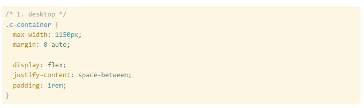
Approach 1 | Implement the desktop design first and mobile later
Bec'use you have a desktop design, why not start with it and then worry later about the mobile. I've done that; I still do when I'm prototyping something. My brain wants me to go with the desktop design; it has more staff and looks fancier, so why not.
Let's say you style the container for the items the following way.
You think the items should stay on top of each other on mobile, so you override the display property. You also add more padding; why not.
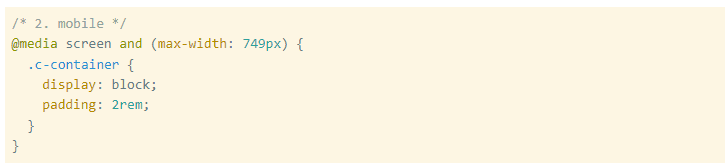
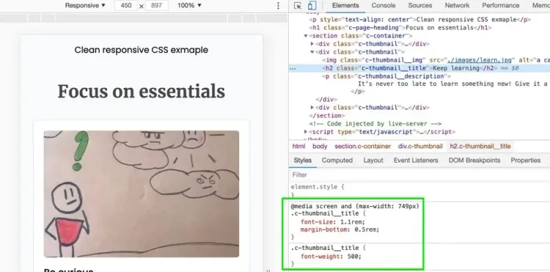
Does this image ring any bells?
We used seven properties to implement desktop and mobile while two CSS declarations are being overridden; it seems like wasted potential.
Sure there must be a better way.
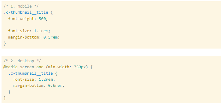
Approach 2 | Implement the mobile design first and desktop later
You know your stuff. You know that it will be so much harder to implement the mobile design after the desktop version. Trying to cram all tho'e fat elements in that small viewport is not a fun experience. You convince your team that you should start from small to big; that's good news.
You may do something like this.
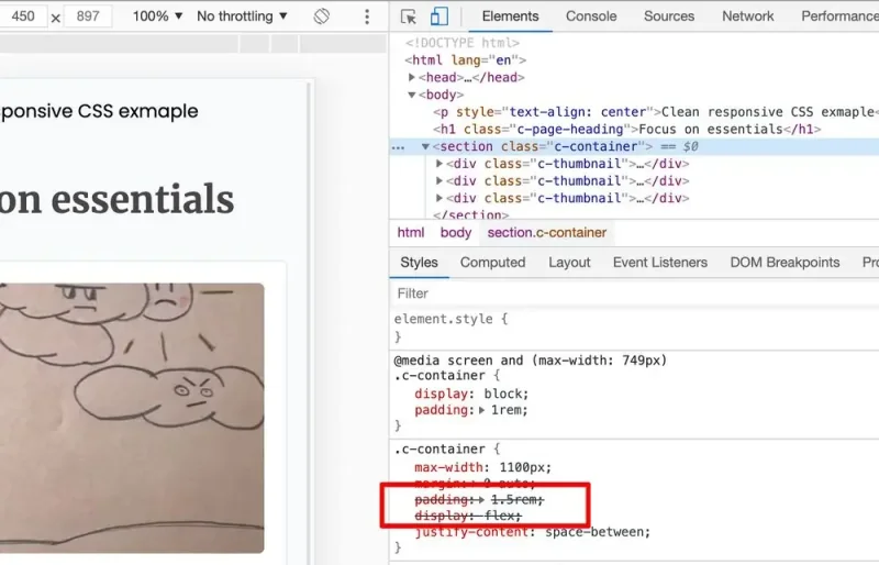
This approach is slightly better than the first one because you have to add only some additional rules without overriding the old ones when you'start small to big. Still, you'll have to override some of them at some point.
What if you have another element with different styling on desktop than on mobile, and you can't just add new properties; you still need to override the old ones.
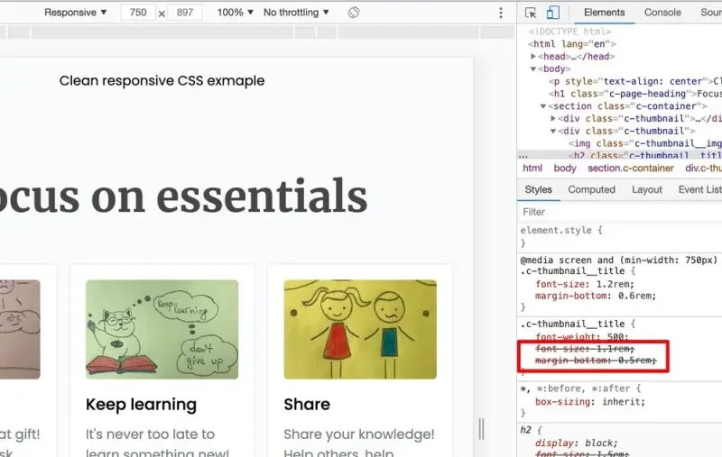
We have the same issue as with the first attempt.
What if I would tell you that there is a better way.
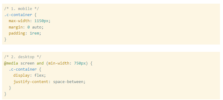
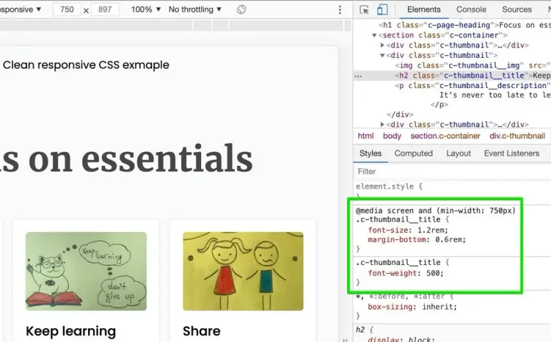
Merge both approaches in one great solution
Write cleaner CSS and avoid seeing it crossed out by encapsulating it in different media queries when implementing a responsive design.
Hooray, no more struck-through CSS properties! 🙄
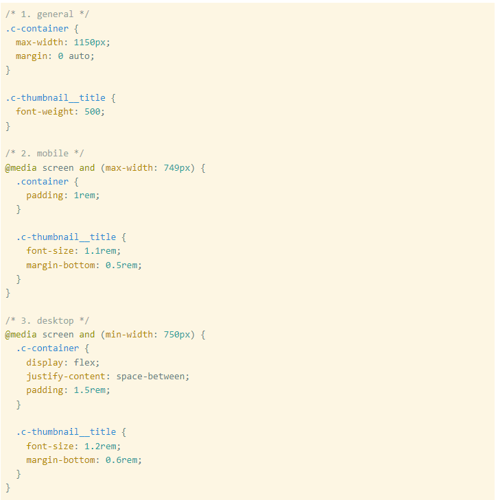
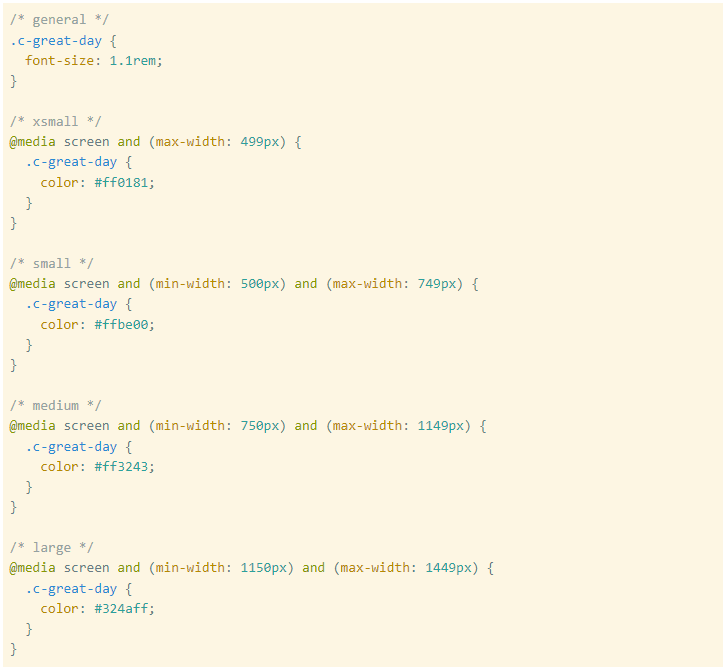
I chose to use only two breakpoints to more accessible showcase the problem, but in an actual project, we may need more. I also avoid referring to my breakpoints as mobile, tablet, desktop, or tv(😁).
I prefer using sizes like xsmall, small, medium, large, xlarge, etc. With this tiny note in mind, we may have the following breakpoints.
Tal' is cheap, so I've created a CodeSandbox and GitHub project where you have the complete example with different CSS files exploring all three approaches.
Check them out!
P.S. There is a small mistake in the clean-responsive.css file, an overriding CSS declaration. See if you can spot it.
Last thoughts
Of 'ourse, there are times when we have to override something to which we don't have direct access. Maybe we added a fancy UI kit that is doing 50% of what we need, and the rest needs to be adjusted. Maybe we are in a rush, and the project manager just wants us to fix the styling for that freaking button. What you gonna do, there is no point in ”wasting a day” 🤯 .
Still, we should strive to make our CSS as straightforward as possible when we have a chance. One way is to encapsulate our CSS blocks in par'icular media queries when implementing a responsive design. This approach won't solve all our problems, but it will make it easier to deb'g a big project's style.
I'v' been using this approach for personal projects for a long time. It's easier for me to keep things clean in small private projects. I can't say the same about all the other projects where I was involved 😀.
Two years ago, I read this article, which made me more confident that this approach is worth using.
See also this short tutorial from Chrome Developers if you want to learn more about overriding CSS declarations.
Have a great day!